
Thursday, October 27, 2011
Monday, October 24, 2011
Stamp Project, Step 4
For my project, I have decided to commemorate Hello Kitty.
 |
| An original drawing by Heather Kithcart, done in graphite and Sharpie marker. |
For more than 35 years, Hello Kitty has served as the icon for kawaii, the Japanese pop-culture of (literally translated) "cuteness" or "adorableness." After being introduce to the United States in 1976, Hello Kitty has brought in over 1 billion dollars for Sanrio, the company responsible for the creation of Hello Kitty, just from markets outside of Japan.
Having her own show and selling merchandise such as clothes, accessories, electronics, and even cars,it seems only fair that Hello Kitty be given her own stamp
to commemorate her 35 years of "cuteness."
Monday, October 17, 2011
Stamp Project, Step 3
Art Deco Style
Examples and Design Characteristics

Art Deco Design
- Streamline (althought "Streamline" is another art style, it is derrived from art deco). Every design has strong lines and are repeted on the same grid, or are paralell to one another.
- Linear symmetry, formal designs
- Very geometric, stays away from any organic lines
- Colors vary but most commonly seen is a monochromatic tone
- Grid oriented
- Can be seen in many buildings built in the 20's, 30's, and 40's

Examples and Design Characteristics

Stamps 1 and 2 in the previous posts are also examples of art deco style.
Art Deco Design
- Streamline (althought "Streamline" is another art style, it is derrived from art deco). Every design has strong lines and are repeted on the same grid, or are paralell to one another.
- Linear symmetry, formal designs
- Very geometric, stays away from any organic lines
- Colors vary but most commonly seen is a monochromatic tone
- Grid oriented
- Can be seen in many buildings built in the 20's, 30's, and 40's

Stamp Project, Step 2

- The first and second stamps are done in an art deco style.
- The images are almost all straight lines, and would read flat without the subtle tonal differences in the monochromatic color palette.
- The portrait page layout on the first stamp gives a little more emphasis and power to the vertical lines, and the design is strong and formal (symmetrical).
- The second stamp has prodiminently horizontal lines for a more calm look, and is asymetrical.
- As for the informational qualities, few can be observed on these particular stamps, but USA was the country of origin on the first. The second was made in Austria.
- The third stamp is oviously a bauhaus style.
- Unlike the other stamps, this piece has highly contrasting color palate.
- This stamp is grid aligned, like the others, but the white circle stands out and adds a slight organic line, and the tilited black shapes add a little more energy to the stamp.
- The design is asymmetrical, but the typographical elements being read vertically add a 'grounding' effect to unify the design as a whole.
- The informational qualities inform us that the third stamp was made in Germany.

Tuesday, October 4, 2011
Project 1, Final
This is my final for Project 1, which has been revised twice. The previous versions can be seen below my Essay post. Enjoy! :)


Wednesday, September 28, 2011
Essay for The Six Words Project
I began my design by first using the rule of thirds when deciding where to place emphasis. I positioned emphasis above the middle horizon, but within the middle third of the page. I made emphasis mainly white and applied a white stroke to ensure it would “pop” against the black. I used an interesting perspective and gave it an almost metallic look to catch the viewer’s eye first.
The next word I wanted to give attention to was balance. I placed it below emphasis but scaled down and made it more opaque, this way it wouldn’t compete with emphasis. I reflected it to demonstrate balance and kept the reflective line almost exactly on the middle horizon.
Contrast was treated very similarly to emphasis; I used a white stroke and a gradient, but this time, the gradient itself demonstrated contrast. I scaled it smaller than balance to create an upside down triangle with the three main words. This keeps the design from being too heavy.
Repetition encompasses the three main words, slightly more grey as to not compete with them. The entire circle is slightly above the bottom third, as not to ‘ground’ the design.
Although alignment is the largest in scale, it is very faint. I wanted alignment to really appear as a background grid that the other words were laid on. I felt it contrasted nicely with the organic shape of repetition and unified the design. It demonstrates alignment just by the position of the word itself, repeated in the form of a square.
Lastly, I created flow. I wanted flow to give a more 3-dimensional look to the whole design, so I changed it’s perspective and added a gradient; now the word seems to “flow” from the plane to plane, instead of across a single plane. I also mirrored it on the other side to create a more formal and balanced design.
Overall, my design is very symmetric and formal, but I did use the rule of thirds to make sure it would be more pleasing to the eye. The focal point is in a third, flow (both of them) is positioned at intersection points of the third markers, and the entire design is shifted towards the upper two thirds of the page. I was careful to vary the scale, font style, and width of each text so that the words were more interesting, and this also improved the space between the words, creating a more appealing negative space, and create unique relationships between the words.
Tuesday, September 27, 2011
Final Revised
In this design, I edited "balance"by downsizing it, to help "emphasis" be the focal point. I also created more 'breathing room' by adjusting "flow." Finally, I slightly reduced the intensity of "repetition." Enjoy! :)


Thursday, September 22, 2011
Draft 2 for "The Six Words"
This is my second draft for this project. On this design, I used Star Wars for my inspiration and deviated from my thumbnails. Enjoy! :)


Draft 1 for "The Six Words"
Here is my first draft for this project. It is extremely similar to my thumbnails and I didn't try to change much. Enjoy! :)


Tuesday, September 20, 2011
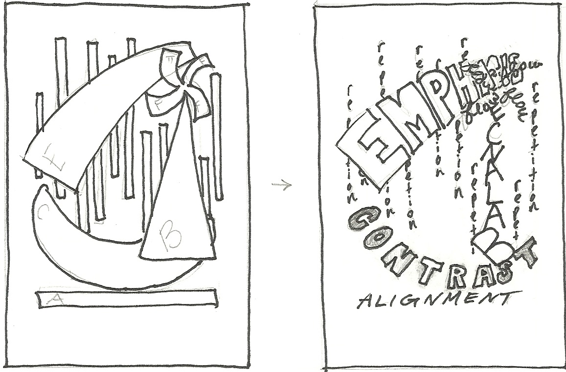
Round 2 Thumbnails
This set of 5 thumbnails are variations on 2 designs from the Round One Thumbnails. Enjoy! :)


Here are 2 variations on one design...

On the right I tried to make emphasis look like a stamp, overlaying the background.
And 2 variations on another...

These two aren't very different, I just changed the placedment of contrast.
And a combination of both...

I tried to combine elements of both, and rework "flow" altogether.
Monday, September 19, 2011
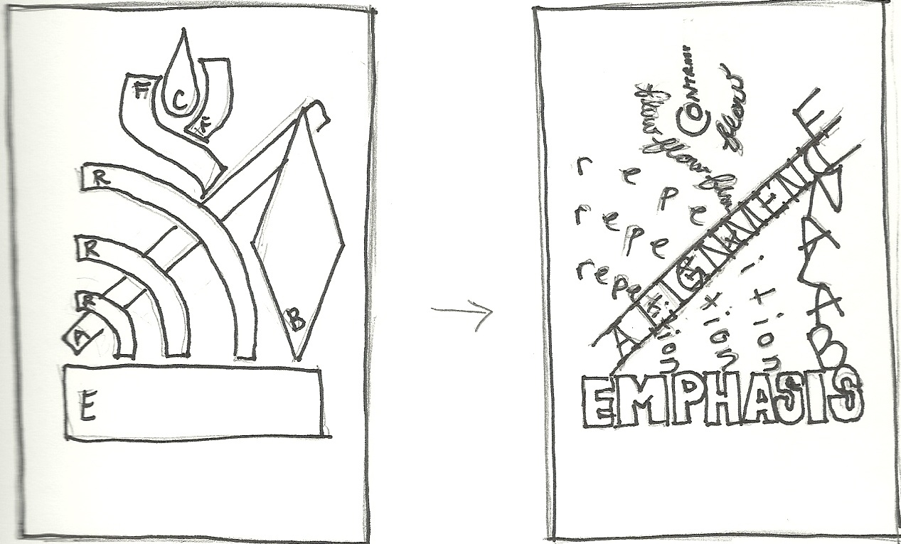
Round 1 Thumbnails, Shapes to Text
The following are the first 10 thumbnails for this project. I have drawn 5 different layouts made only from shapes, and then converted each one to a possible text version. Enjoy! :)


Subscribe to:
Posts (Atom)